Fig Documentation
Fig XML Settings
FigLite and FigPro share a few of the same settings so you should look over them both if you are going to be using FigPro. The differences between the two are minimal now, but that will change as FigPro is upgraded in the future. FigLite will likely stay much the same and will only be updated for bugs.
FigLite XML Settings
Here is the list of all the settings that can be set in the settings.xml file included with Fig:
        150
        150
        1
        10
        12
        Arial, Verdana
        Navigation
        white
        false
All the settings are optional and any missing settings will default to the above values. Here is a detailed description of each setting.
- urlToFig - Leave blank unless your are going to embed Fig in a file outside the fig folder, which also requires setting some Flash Vars.
- thumbWidth - The max width of thumbnails in pixels. Larger widths will be cropped in Fig.
- thumbHeight - The max height of thumbnails in pixels. Larger heights will be cropped in Fig.
- thumbBorder - Border around thumbnails in pixels.
- thumbPad - Padding around each thumbnail in pixels.
- fontSize - Size of fonts in points.
- fontFace - List of font faces to use. Multiple fonts can be listed such as "Arial, Helvetica, Verdana". If the user does not have the first font, Fig will fall back to the next font. If the user does not have any of the fonts, the default system font is used (I think). It's best to use system fonts that most systems have.
- navText - The text used for the main navigation button.
- theme - Can be set to "black" or "white".
- removeNav - Set to "true" or "false". A true value will disable the navigation. This setting is useless without setting the Flash Vars to load a default gallery.
FigPro XML settings
FigPro has the same settings as above with exception to the theme setting. Instead of the theme setting there are five color settings. Here are the additional settings in figPro:
50
false
00394D
E6F9FF
00BFFF
E6F9FF
4D2700
- galleryPadTop - Number of pixels from top that thumbnails will start. Defaults to 50 so thumbnails start below the navigation button. A Useful setting if removeNav is set to true and you want your images to begin closer to the top.
- removeCredit - "true" or "false". A true value will remove the link back to flashimagegallery.com in the right-click context menu.
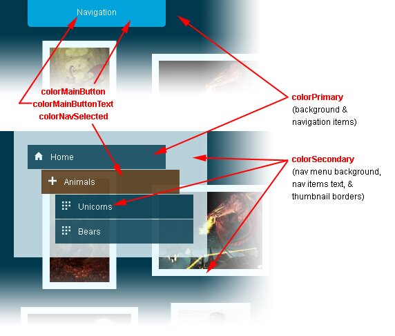
- colorPrimary - Color of background and navigation items.
- colorSecondary - Color of text, navigation menu background, thumbnail borders, and loading symbols.
- colorMainButton - Color of the "Navigation" button.
- colorMainButtonText - Color of the "Navigation" buttons text.
- colorNavSelected - Color of the currently selected menu item in the navigation.
The five Hex color settings replace the theme setting in figLite to give you more control over the colors. The list of color settings could be expanded, but I am trying to keep the amount of settings down while still giving control over the colors.
The color settings above were generated by the slick colorschemedesigner.com and will result in a deep blue theme like below. Try to make sure there is maximum contrast between the primary and secondary colors as they are used to color the navigation buttons text and background. If there is not enought contrast, the menu items will be hard to read.
If you leave all the color settings out, they will default to the values below which will generate the standard white theme with an orange color for the currently selected navigation item.
FFFFFF
000000
FFFFFF
000000
FFCC00